Monique Angeli
  • WORK
  • ABOUT
  • BOOK
  • RESOURCES
  • CONTACT

BIKEPRO

I designed a CTA button and 4 screens
to enable 
​purchase via the Cycle to Work Scheme.

Overview

​BikePro is the final project of the UX Design course by Design Circuit. Through this work I had my first contact with the profession in practice, participating in all stages of the process. A real client was prospected in order to find real problems.
The client
Ferris Wheels is a bike shop based in Dublin, Ireland. It is a family owned business located at the same address since its founding in 1972. The owner is well known in the surrounding area, ​with his professional image already well established.
Ferris Wheels
Ferris Wheels Bike Shop
What was at stake

During the kick off, the client explained the difficulties arising from BREXIT, such as the increase in the price of bicycles and the preference that factories give to large stores. As a result, sales are limited to the local user, where 80% of which comes from the program CYCLE TO WORK SCHEME.
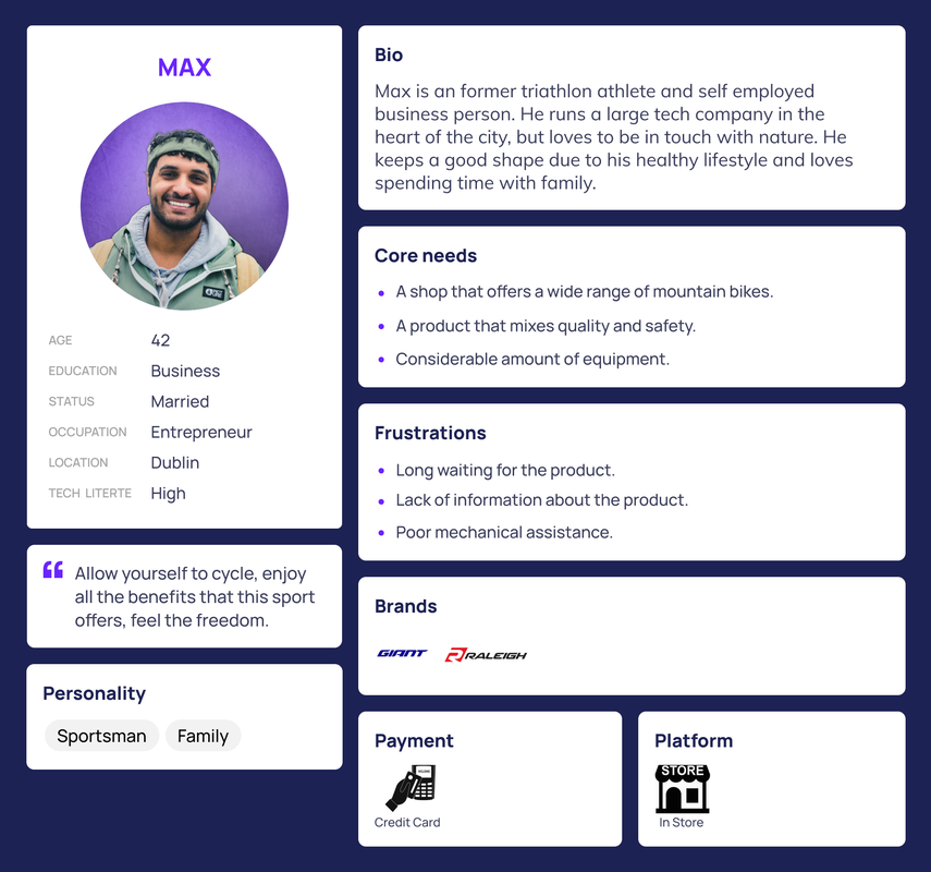
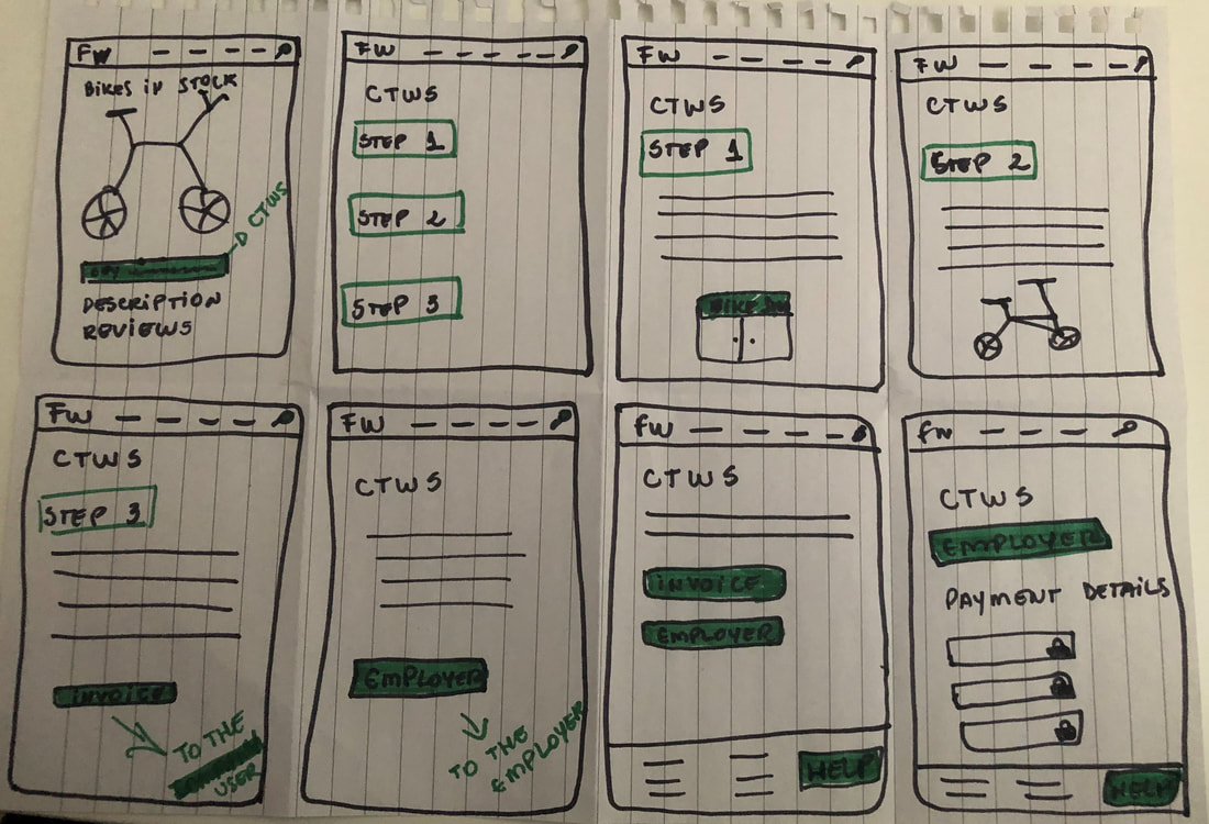
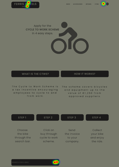
​The CYCLE TO WORK SCHEME allows employees to obtain commuter bikes and cycling accessories through their employer, whilst spreading the cost over 12 months and making unbeatable savings through a tax break."
​Source: revenue.ie
RESEARCH

At the discovery phase, a series of surveys and interviews have been conducted to understand users' needs and pain points.
FIELD STUDY - Upon learning about their target audience, I spent a day at the shop observing behaviours and talking to some customers. One of them, when asked about the shop's website, stated that she does not usually buy a higher-value artifact such as a bicycle online, but she would like to see the product with a photo and description on the website.
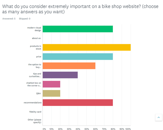
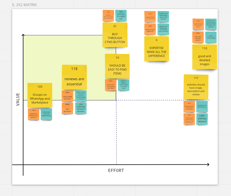
I don't buy online, but I would like to see the product on the website, it helps with my purchase decision." Kate, about the shop's website.
FOCUS GROUP - I also conducted two focus groups with 6 users in total to understand how these customers bought through the program. All reported having encountered difficulties to make the purchase, with conflicting information and with no online purchase option.
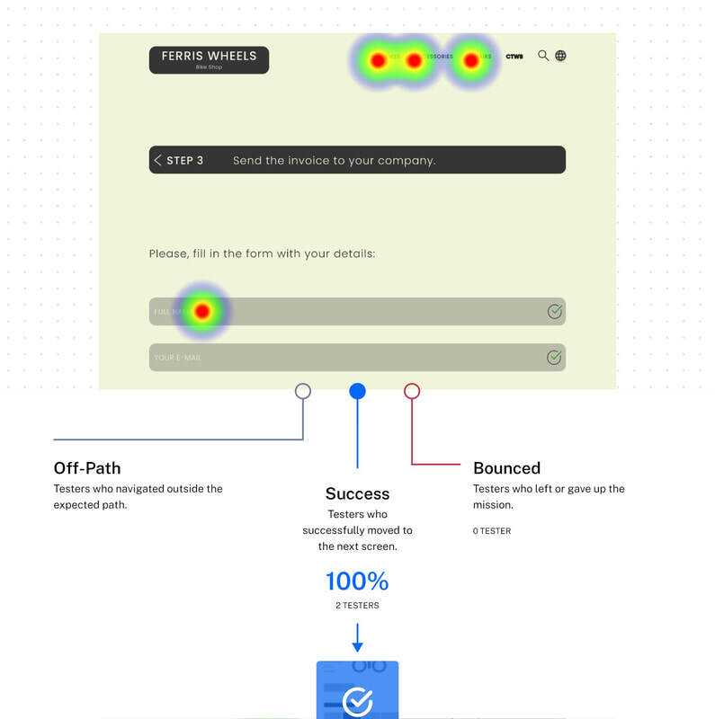
I had a little difficulty finding information about the program. I had to talk to some workmates who had already done it. After choosing the bike, I also had to make several trips between the shop and the company to complete the documentation. I found it a little bit annoying." Josh, about the SCHEME.
USER INTERVIEW - I performed a series of interviews with users from various audiences in order to understand how people relate to the bicycle and other ways of commuting. There were 18 interviews, each one tailored to the specific type of user:
AMATEUR
BLEEPER
BREXIT
BUS DRIVER
CARGO BIKE
E-BIKE
EXERCISE BIKE
FOLDING BIKE
FORMER THIEF
MOTORCYCLE
PATINETE
PENNY FARTHING
SPECIAL NEEDS
TECHNICAL ASSISTANCE
TRYATHLETE AND BRAND LOVER
WEEKENDS
WILL BUY
WORK
ONLINE SURVEY - And to understand how the user's relationship with online shopping takes place, I ran an online survey with 30 people from different audiences and another one with 5 CYCLE TO WORK SCHEME users. The research brought some interesting information, such as the sense of security that people have to known websites and the value that the user gives to reviews and referrals from acquaintances.
Online Survey
Online survey applied to CTWS users
PERSONAS

Based on the data collected, two personas were found, Emily and Max, who represent two distinct groups: office workers and weekend athletes.
Emily
Emily | Office Worker
Max
Max | Weekend Athlete
FINDINGS

After several surveys and interviews applied to 72 users in total, 12 insights were considered of the greatest importance to explore possible solutions. Most users pointed out that it is essential that the website brings the image of the products, as well as their description and review. Another problem addressed was the difficulty in finding information about the CYCLE TO WORK SCHEME and the lack of option to buy through the website.
Affinity Mapping
Affinity Mapping
See full board here.
HOW MIGHT WE?

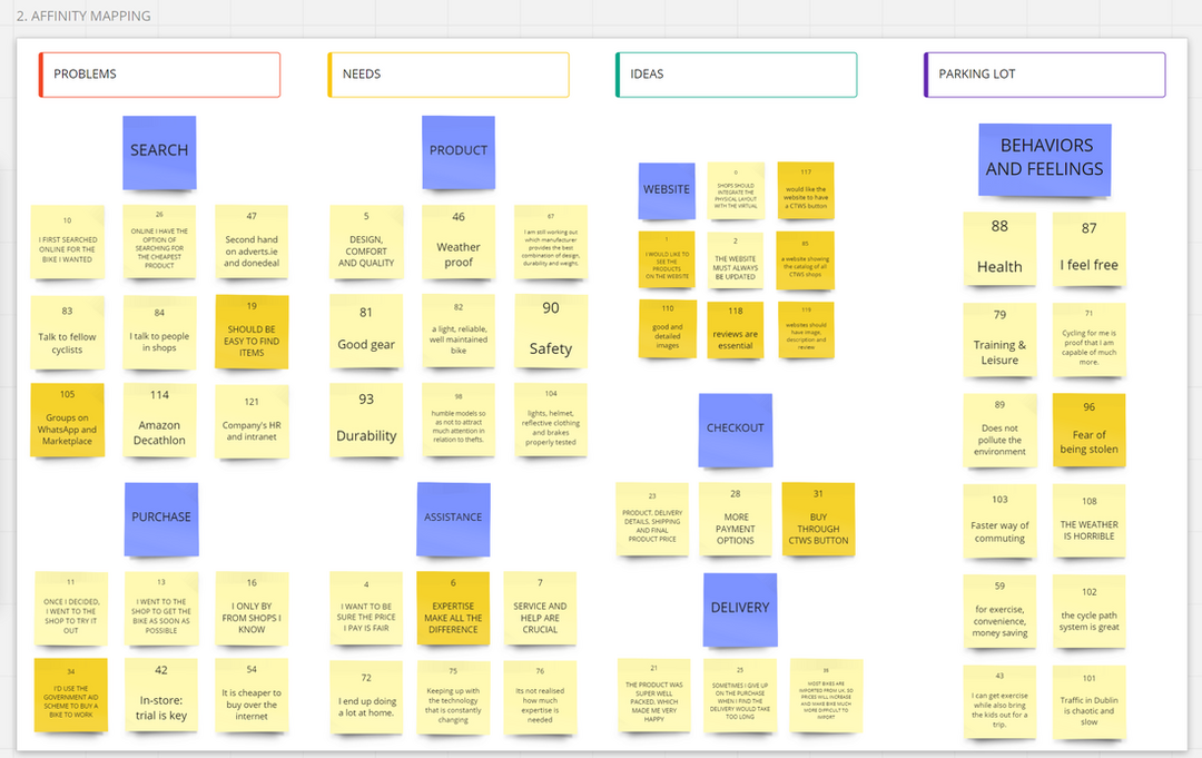
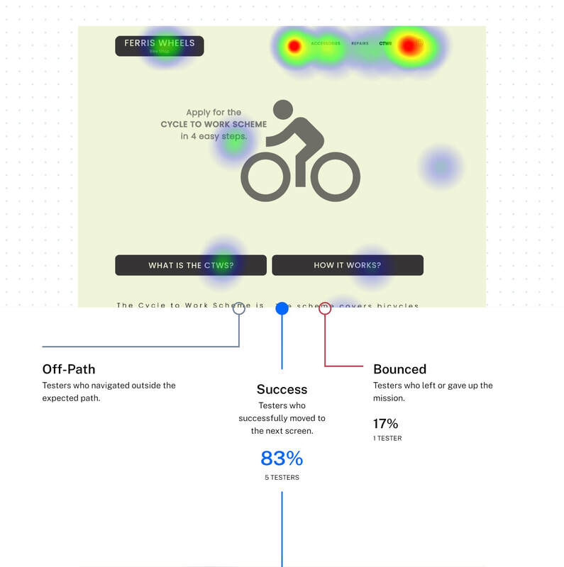
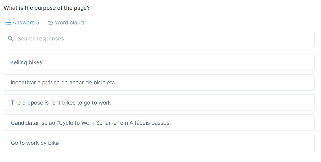
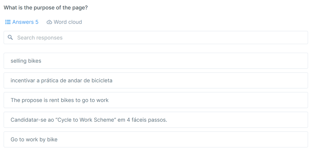
How might we facilitate the the cycle to work scheme process for the user?"
HMW?
How Might We?
See full board here.
PRIORITIZATION

As 80% of the shop's sale goes to the CYCLE TO WORK SCHEME user, this problem has been considered a priority. As shown in the 2x2 matrix below, a possible solution that is of great value to the user and would facilitate the purchase on the website is the development of a button that allows the user to do the process himself.
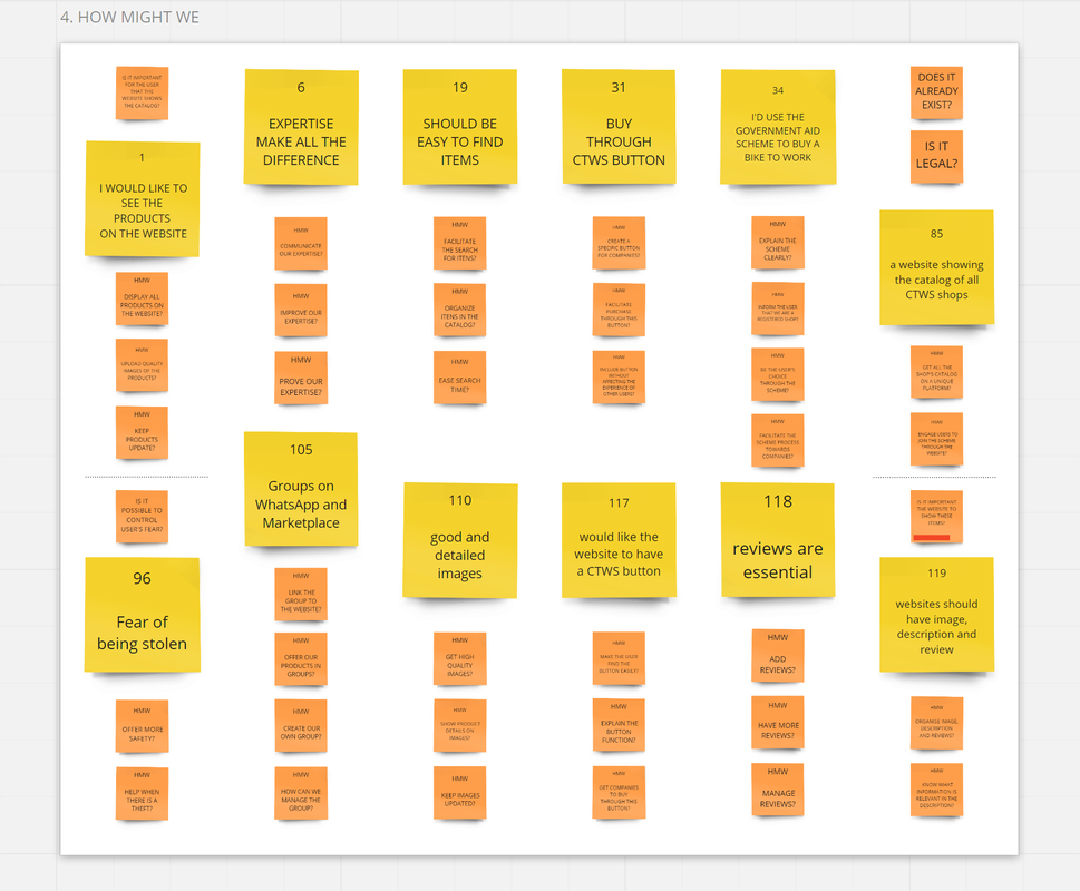
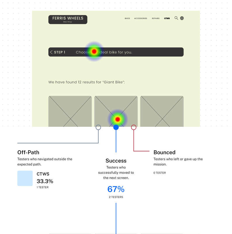
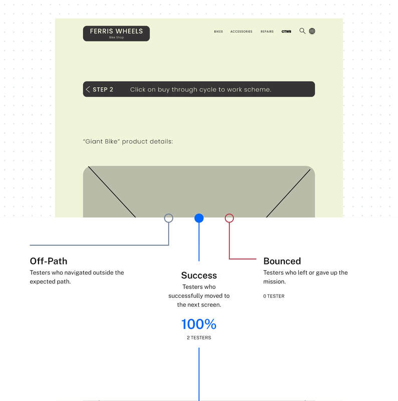
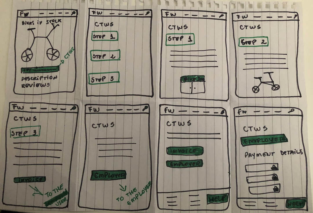
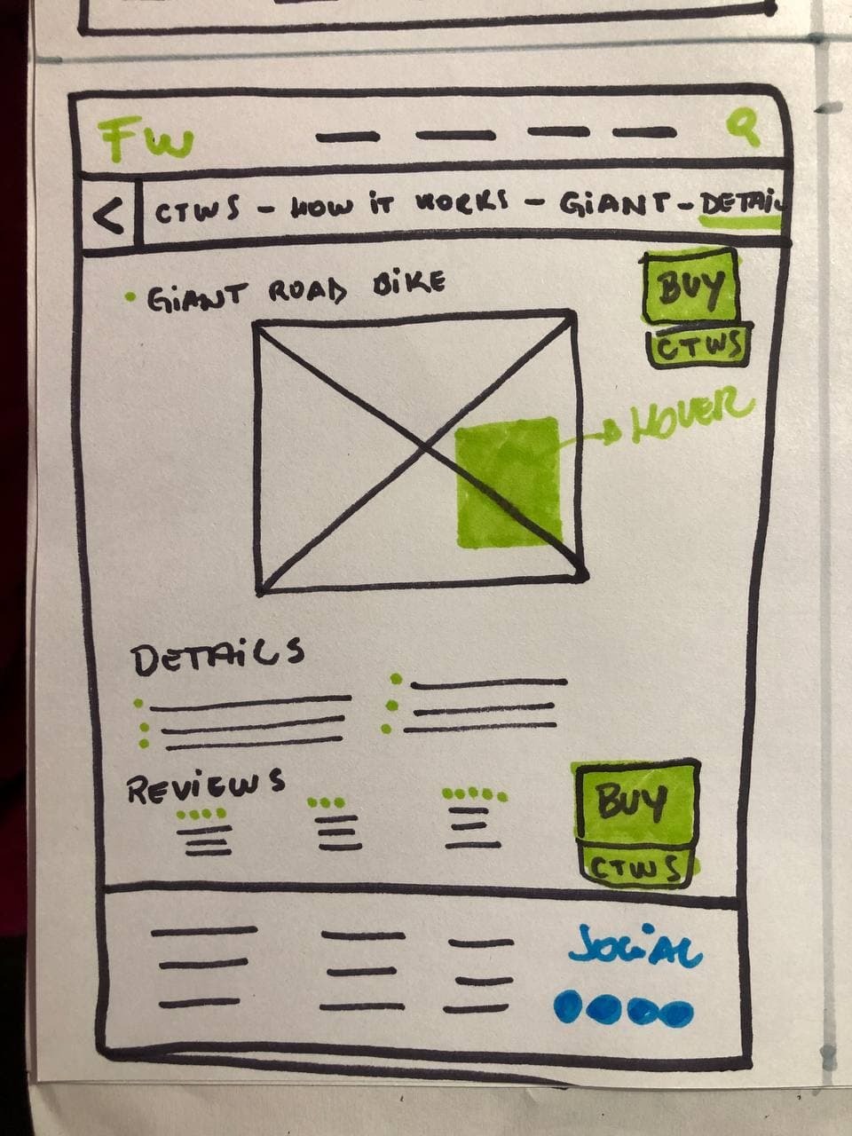
A button called BUY THROUGH CYCLE TO WORK SCHEME.
2x2 Matrix
2x2 Matrix
See full board here.
INFORMATION ARCHITECTURE

After the decision to create the CYCLE TO WORK SCHEME button, I verified that users showed it would be easier to find it in the "Bikes" section, located in the menu. Another way also accessed was through the "Need advice?" section, also located in the menu. In the final design, it was suggested the creation of 5 screens dedicated to the CYCLE TO WORK SCHEME, the first being the home page. A card sorting was done too for the general organization of the menu.
Treejack.
Treejack with 10 users.
Card Sorting
Card Sorting with 10 users.
CRAZY 8s

Some ideas for the CYCLE TO WORK SCHEME section.
Crazy 8s
Crazy 8s
PAPER WIREFRAMES

According to the surveys, 100% of respondents had said they have faced difficulty finding information about the CYCLE TO WORK SCHEME and, upon finding them, there was a lot of mismatched information, making it even more difficult to purchase a bicycle by the program.
Picture
Picture
Picture
Picture
Picture
Picture
LOW-FIDELITY WIREFRAMES

With this, a step by step of 4 easy steps was designed in order to better organize the information, thus reducing the friction between the content and the user.
Picture
Low-fidelity wireframes.
See full wireframe here.
5 SECONDS TEST

This test has shown that the "CTWS" button was not clear to users if only inserted in the header menu. Therefore, a search box has been included for easier searching.
5sec
Answers
Answers
FIRST CLICK TEST

After sketching the home page, the tests still demonstrated the need for improvement in the search for the product, increasing the visibility of the search box.
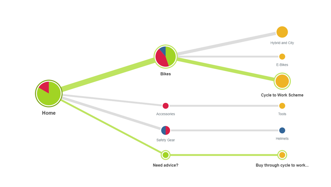
Where would you click to search for a bike?"
1click
First Click
USABILITY TESTING

During the usability test, the following feedback was collected and analysed:


  • positioning of the search bar at the top of the page, possibly on the left side;
  • insert an info box at the corner of the accessories field to explain how to add them;
  • study other possibilities for the color palette, as some users didn't feel comfortable with their composition because there is not much contrast (the palette was analysed by the WCGA Color Contrast to offer a better experience for color blind people, see full report here ACCESSIBILITY);
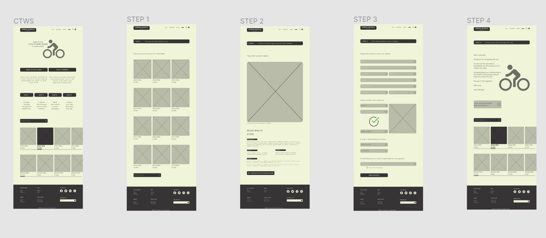
  • reduce the step-by-step for users who understand the process and direct them to the purchase page straight away;
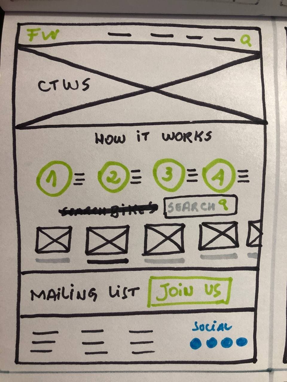
  • eliminate the search option in the menu so as not to confuse the user when searching for the bicycle after step by step;
  • reduce the length of the pages, avoiding endless scrolling and providing the user with greater agility in reaching the goal;
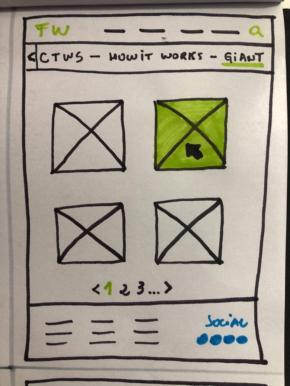
  • increase the size of the search button, making it easier for the user to find it;
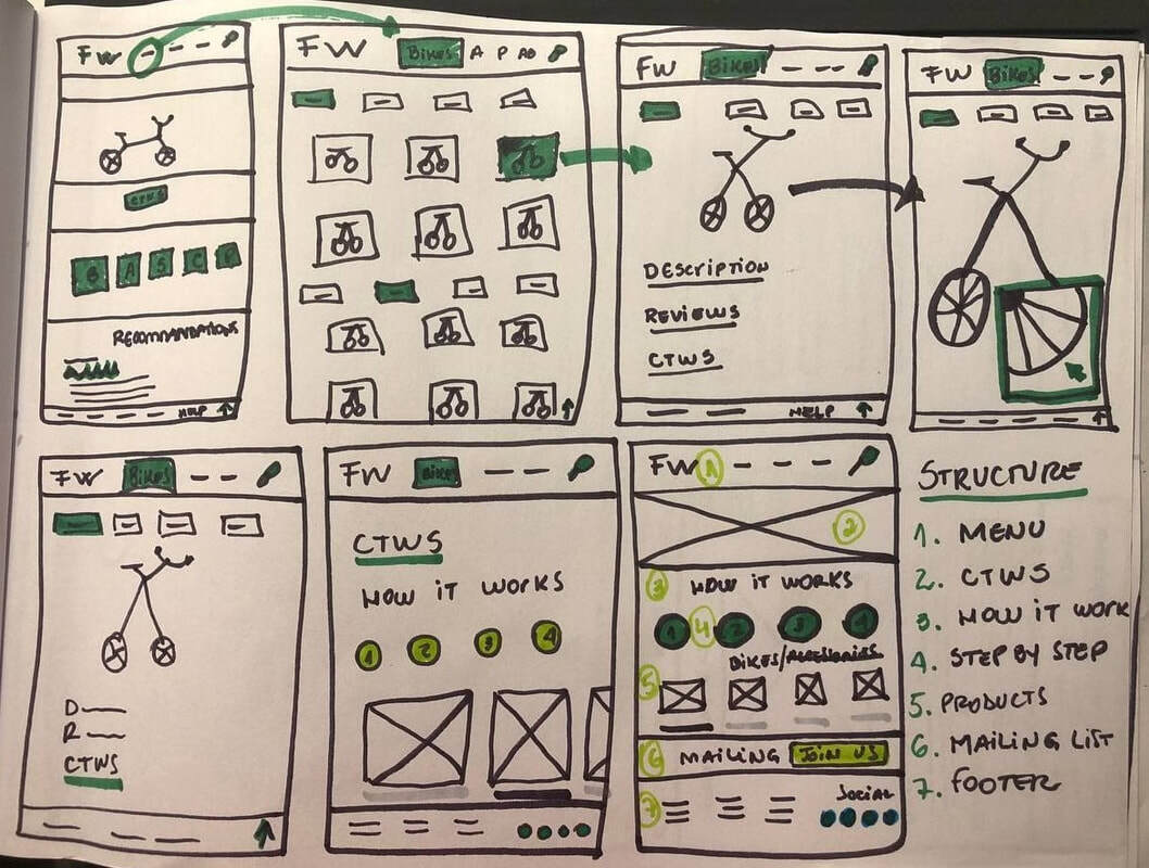
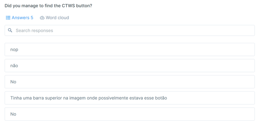
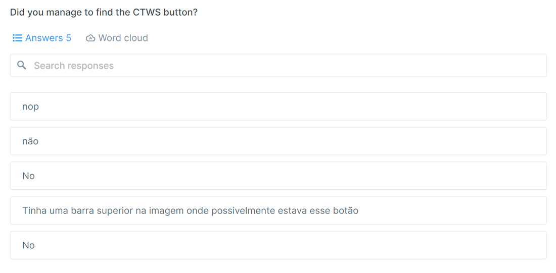
  • reformulate the "CTWS" button in the menu so that it is found quickly.
Picture
Picture
Picture
Picture
LEARNINGS

With BikePro I had the opportunity to apply the theory learned in practice, providing me with a vast understanding of research processes and methodologies, from customer prospecting to deliverables. With that, I was able to discover myself as a professional and identify in which area of UX my career will be directed. And it also contributed to my evolution as a person. After all, studying human behavior expanded my mind, making me a more empathetic and creative being. I can not wait to act in real life.
Site powered by Weebly. Managed by Porkbun
  • WORK
  • ABOUT
  • BOOK
  • RESOURCES
  • CONTACT